Lessons from a selection of the best ranking wellness practitioner websites
Let’s take a peek behind the curtain of the top 5 websites that were listed in Google for a search on ‘Best Wellness Practitioners in London’ and discover the secrets that makes a great wellness practitioner website. I do hope this is useful for any Wellness Professionals looking to create their own website or work with an agency to do it.
Approach
As we are an AI company, I wanted to utilise the latest AI systems to help complete the task efficiently. First thing to do was select the criteria to review the wellness website designs on. Having 20 year’s experience in the field of website design and marketing I of course have my own views but wanted to see what Chat GPT came up with so asked it for the top 10 factors covering usability, conversion optimisation etc. I did adjust some of the recommendations, but the AI driven list was a good start.
After selecting the top 5 best wellness websites in Google search, I created a prompt for Google Studio to review the sites based on the factors above. I then had it look over each website up to the first 4 or 5 screens. It provided a text-based response which I then uploaded into Claude AI (probably the best for writing nice copy at the moment) to edit the text into something easier to read. From there I manually (I know!) edited the text and compiled it here. I reviewed these on a desktop and plan to in the future do similar for mobile versions too.
First Impressions Matter
You know that feeling when you walk into a spa and instantly feel relaxed? That’s exactly what a brilliant website should do. Take Peppermint Wellness, for example. The moment you land on their page, you’re greeted with bright, cheerful colours and natural images that make you want to take a deep breath and smile.
But it’s not just about looking lovely. The site achieves something crucial: making it super easy to find your way around. Think of it as walking into a well-organised shop where all the signs point exactly where you need to go. Work With Me? Right there. Dive a little deeper? Just click. Need to get in touch? There’s a button for that! Very strong CALL TO ACTION buttons all above the fold (the first screen you see).
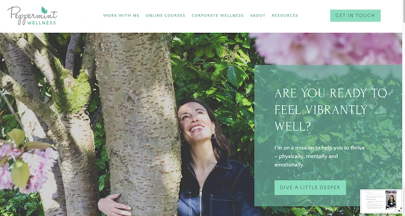
The Human Touch
The site puts a face to the name. Right up front, you meet Suzy, the founder, smiling and welcoming you in. It’s like walking into your local café where the owner knows your name – it certainly feels different from those faceless corporate websites.
Suzy then shares her story. It’s genuine, it’s relatable, and it makes you think, “She gets it!” It’s smart personal branding.
Making It Crystal Clear: What’s On Offer?
Nobody likes playing detective to figure out what a business actually does. This site breaks it down into three simple options:
– One-to-one coaching (for when you want that VIP treatment)
– Corporate wellness (bringing good vibes to the workplace)
– Self-paced programmes (for the DIY champions among us)
Each option comes with its own “click here” button – no treasure hunt required!
The Secret Sauce: Keeping It Real
What I think makes this website pop is the storytelling. Instead of hitting you with sales pitch after sales pitch, it shares a journey. Suzy asks, “Are you feeling stressed and overwhelmed” she follows up with “I’ve been there too,” it’s very engaging and authentic.
What We Can Learn From This Website
Here’s what makes this site a winner (and what you should look for in any great website):
The Good Stuff:
– Colours that make you feel good (think spa day, not tax office)
– Lots of white space giving the images and text room to breathe
– Navigation that’s easy
– A real person you can connect with
– Stories that make you go “Same!”
– Clear next steps (no “what do I do now?” moments)
– The transition from a wide screen to using a mobile screen is very good maintaining the flow
Room for a Little Extra Polish:
– Could benefit from an FAQ section that could help those that have questions and improve SEO.
The Bottom Line
A great website isn’t just about fancy design or whizzy features. It’s about making visitors feel welcome, understood, and confident they’re in the right place. It’s like hosting a garden party – you want your guests to know where everything is, feel comfortable, and stick around for a while.
Peppermint Wellness proves that with the right mix of warmth, clarity, and professionalism, any website can become a digital home where visitors want to hang out.
Remember: If a website makes you feel welcome, makes it easy to find what you need, and gives you clear next steps, it’s probably doing something right. And isn’t that what we’re all looking for when we land on a new site?
Right off the bat, this website wraps you up in the softest visual blanket of creams, browns, and gentle touches of green. Rather lovely, really. At the top of the homepage, there’s this absolutely gorgeous shot of fresh produce with someone’s hands thoughtfully at work – it’s not just pretty as a picture, mind you, it’s practically whispering “welcome to your wellness journey.
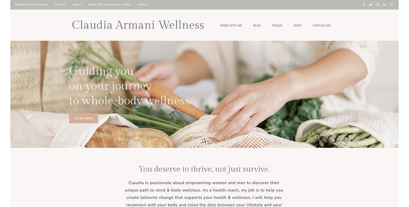
The whole experience feels seamless, with every element flowing naturally into the next. Navigation is nice and easy. No faffing about with drop-down menus or hidden buttons – everything’s right where you’d expect it to be. The text is clean and crisp, with plenty of breathing room (though they could do with a smidge more contrast to make it easier on the eyes).
The Message
“Guiding you on your journey to whole-body wellness” – straightforward and sweet. The “Learn More” button is subtle but enough to catch your eye without being shouty about it. The whole thing reads like you’re having a proper chat with a knowledgeable friend over coffee – warm, informative, and genuinely caring.
Room for improvement? The text on the main image could be a tad easier to read (rather like trying to read a menu in a dimly lit restaurant). Also could do a little more above the fold to explain what the business does, it’s not until we scroll down that it becomes clear.
Building Trust: The Foundations Are Solid
Everything about this site feels reliable. The colours, images, and messaging work together. Social media links are sprinkled throughout- adding just the right touch of connectivity.
That said, it’s missing a few tricks. Only one testimonial? Would be nice to see some more to build confidence and trust. An FAQ section wouldn’t go amiss – sometimes you just want a quick answer without the faff of sending an email.
Behind the Scenes: The Technical Bits
The site runs smoothly – quick to load and properly secured with HTTPS. Technically speaking, it’s ticking the boxes.
Meet the Wellness Wizard: The Claudia Section
Scrolling down we meet Claudia herself. The image isn’t the most professional but does the job. It’s nice to see the face behind the brand – makes it all feel more personal and increases engagement. Her story as a Pilates teacher and wellness coach unfolds naturally, showing off her expertise without being arrogant. The design keeps that calm, natural vibe going strong with a neat layout.
The Services: Clear as Crystal
The services section is divided into three areas (The Shop, Services, and Blog), each with its own lovely image which are consistent with others in the site. Image consistency is one of the main areas that seperates amateur from professional looking sites.
The Final Verdict: Good Show
This website is beautifully presented. Soft, gentle and thoroughly enjoyable, leaving you feeling rather well taken care of. It’s got all the main ingredients spot on: peaceful design, straightforward navigation, and a warm, welcoming vibe.
Could it be even better? Well, yes:
– A dash more contrast for the text (reading shouldn’t feel like squinting at a menu in a fancy restaurant)
– Some more glowing testimonials (we all love a good success story)
– An FAQ section (because sometimes you just want to know without asking)
All in all, though, it’s a smashing example of thoughtful web design. It’s the kind of website that makes you want to put the kettle on, settle in, and explore every corner.
This is a wellness website that understands the power of simplicity. It has minimalist design, but does it deliver the engagement that modern visitors expect? Let’s dive in.
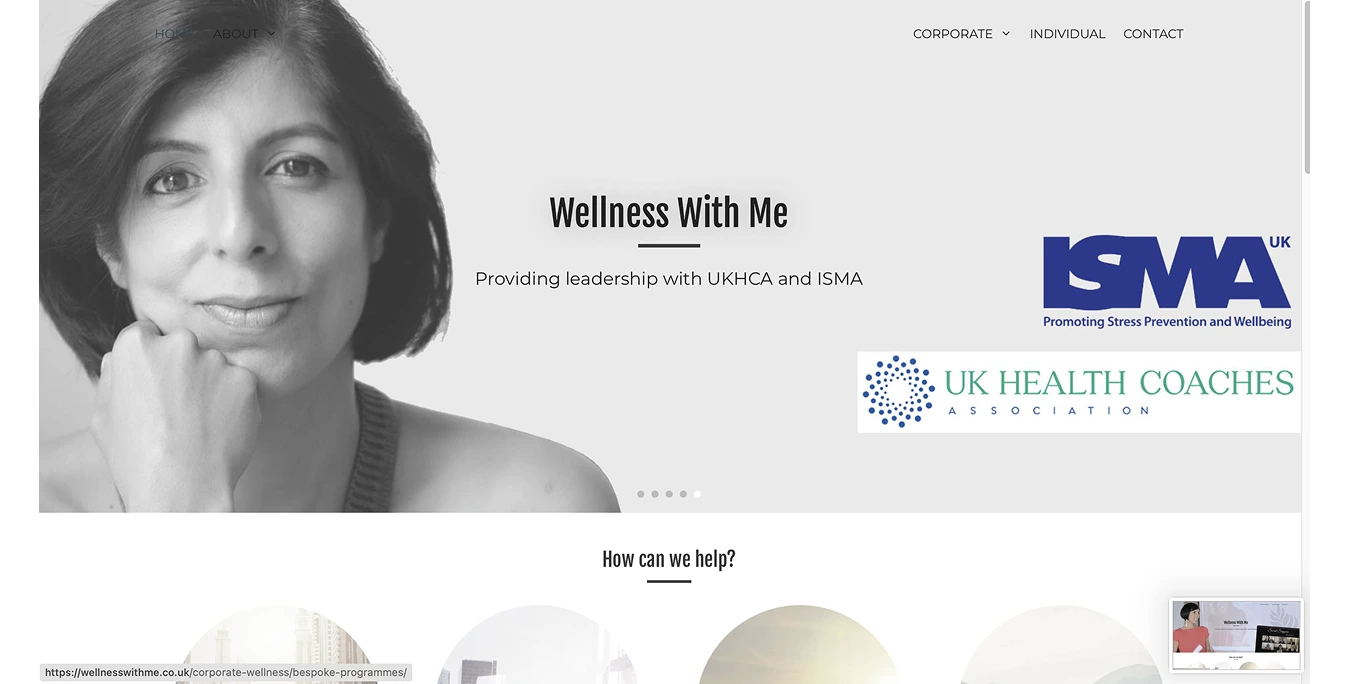
The moment you land on the site, you’re greeted by a carefully crafted colour palette of soft greys, whites, and muted tones. It’s quite calming, but the scrolling banner presents different images that don’t really tie in with each other. It is also well documented that scrolling banners do not convert as well as simple static images in this hero section. Just one of these images would probably give better conversions and make the site simpler to navigate.
Navigation is split left and right which is different. I didn’t notice the left menu for a while and on some of the slider images it’s very hard to see. Would be easier for users if the navigation was kept together in one area I would suggest. The brand’s identity does shine through, but research suggests that almost no one wants to wait for all these slides to auto scroll in order to pick up the various messages. Better to put a concise message on a static image. The hero area above the fold could also do with an action button to increase conversions.
The User Experience
Further down, the website’s layout is thoughtfully structured. Clean dark fonts and generous white space create a well contrasted reading experience, while subtle hover effects on buttons add a dash of interactivity without compromising the minimalist design.
The “How Can We Help?” section uses large circular images instead of the usual grid or list format. It’s visually striking and guides the eye naturally through the offerings. However, these images could work harder with additional descriptive text or clear buttons underneath to help visitors understand what’s available. Simple additions like “Learn More” or “Book a Consultation” buttons would make it easier for visitors to take the next step.
The Personal Touch: Meeting the Expert
The presentation of founder Tayyaba Jordan pairs a professional photo with a concise introduction that creates an immediate connection. The addition of a video teaser, showing Tayyaba speaking at the European Summit on Wellbeing at Work in 2021, adds dynamic credibility to her expertise. The video call-to-action is strong.
Building Credibility: The Trust Factor
The “Companies We Have Worked With” section effectively showcases their experience with respected businesses. Adding real feedback from somne of these corporate clients would strengthen their credibility significantly.
The client testimonials would be stronger if they were all from actual clients if possible. Scrolling make it hard to view and people are rarely willing to sit and wait for a website to scroll itself.
Finishing Strong: The Footer
The website’s footer is short and efficient design, featuring:
– A clear call to action (“Interested in working together?”)
– Easily accessible contact details
– Well-placed social media links (Facebook and LinkedIn)
– Professional membership badges
What Really Works:
– Clean, modern design that promotes calm
– Strong personal branding elements
– Impressive corporate credentials
Areas for Enhancement:
– More prominent calls to action
– Too much auto scrolling
– Detailed service descriptions
– Addition of more named client testimonials
– Continued focus on accessibility
Wellness With Me has created a nice digital space. The content is solid, but the presentation and navigation could be improved.
The moment you land on COMO’s wellness pages, you’re greeted by a sense of calm and sophistication. The secret? It’s all in the details: a carefully chosen neutral colour scheme, elegant fonts, and thoughtfully placed images. The design team has mastered the art of white space, letting each element breathe whilst creating an atmosphere of refined luxury. The site does have a feel more corporate feel because that is reflecting its brand.
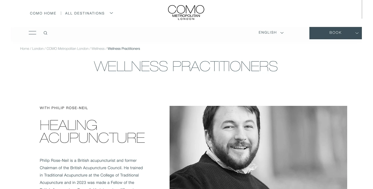
Getting around the site is a breeze, thanks to clear menus and subtle breadcrumb navigation (those little links at the top of the page showing your location on the site). Breadcrumbs are recommended for sites with more pages. The main “Wellness Practitioners” heading stands proud and clear, in a beautiful, elegant font leaving visitors in no doubt about what they’ll find.
The Personal Touch
Take the acupuncture section featuring Philip Rose-Neil, for instance. It balances professionalism with warmth. A striking black and white portrait gives the page a timeless feel, whilst the writing strikes just the right note – informative without being overwhelming.
When it comes to the actual sessions, COMO’s website describes the treatment in a simple way with clear pricing. descriptions are crystal clear, and – refreshingly for a luxury brand – they’re completely upfront about prices. The “Book Now” link would be better in my option to look like a button making it clearer for users.
What could make it better? A bit more detail about session lengths and available time slots would be helpful, and perhaps a “Save for Later” option for those still making up their minds. The Book Now button opens an email, a Calander showing available slots would convert better.
A Consistent Experience
The yoga section, featuring instructor Kelly Brooks, maintains the same polished approach. Beautiful photography consistent with images above and engaging descriptions tick all the right boxes. Adding a few more details about what to expect from a session could help seal the deal for hesitant visitors.
The Final Flourish
The website’s footer (that often-overlooked section at the bottom) maintains COMO’s signature style, with easy access to other areas of the business.
What Makes This Website Special?
The strongest elements include:
– A clean, sophisticated design that never feels cluttered
– Professional photographs that build trust
– Well-organised information about practitioners
– Clear pricing (no nasty surprises)
Room for improvement:
– More direct booking options on practitioner profiles
– Additional details about session availability
– Easier-to-spot booking buttons
– More ways to engage visitors through features like testimonials
The Verdict
COMO Metropolitan London’s wellness pages offer a digital space that’s both sophisticated and welcoming. With just a few tweaks, like adding more booking options and session details, it could be easier for potential clients. Whether you’re building your own website or simply curious about what makes a good one, there’s plenty to learn from COMO’s approach.
Let’s explore this through the lens of London Wellness Coach’s website, uncovering valuable lessons about effective digital design along the way.
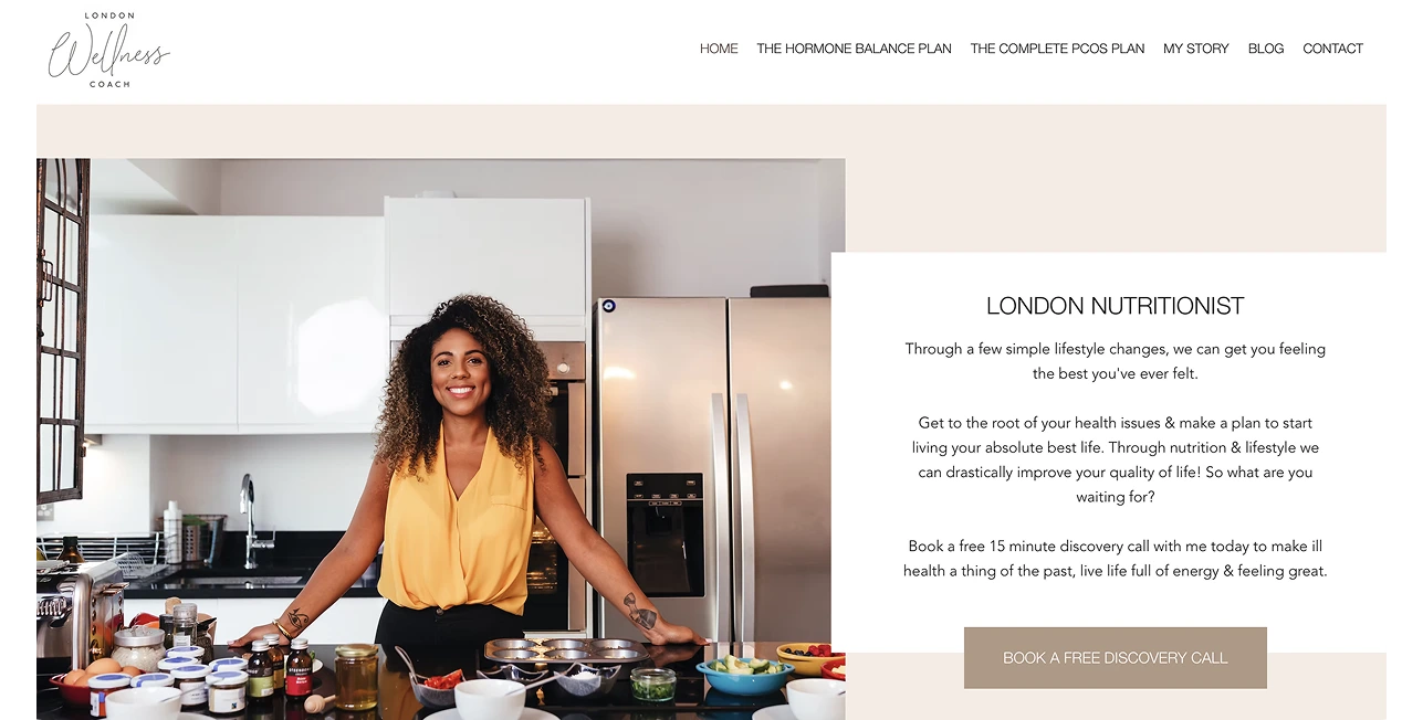
Creating That Perfect First Impression
Picture walking into a bright, airy space. That’s exactly how this website feels, with its soft beige and white colour scheme complemented by gentle peachy touches. A thoughtfully placed image of a Lauren in a kitchen adds a dash of authenticity – it’s personal rather than corporate, which is precisely what many people want when seeking wellness guidance.
The website keeps things brilliantly simple. Clear headings guide you to exactly where you need to go, whether that’s learning about hormone balance, exploring PCOS plans, or discovering the coach’s story. There’s no hunting around complicated menus or getting lost in a maze of pages.
Getting the Basics Right
The site ticks all the important boxes for good design: it’s easy to read, visually pleasing, and doesn’t overwhelm visitors with too much information at once. The strategic use of white space keeps everything feeling uncluttered, whilst the font choices ensure everything’s crystal clear.
The above the fold experience is superb. In a few words we know the answers to the key questions: Who are you? What do you do? How can you help me?
Then a prominent “Book a Free Discovery Call” button makes it obvious how to take the next step – a crucial element for any service-based website.
Making It Personal
The background in this next section clearly separates it from above whilst maintaining design integrity. But what really sets this website apart is how it builds connection. A video introduction brings the coach to life, helping visitors feel like they’re meeting a real person rather than just browsing another website. The messaging throughout feels warm and conversational, more like chatting with a knowledgeable friend than reading a corporate brochure.
Super Strong References
The reference strip of TV, Radio and Magazines are very impressibve and push credibility through the roof. Followed by the four sections on Public Speaking etc with clear images are hard to beat.
What Makes It Work?
The strongest elements include:
– A clean, modern design that’s easy to navigate
– Warm, professional messaging that builds trust
– Clear calls to action that guide visitors naturally
– Effective use of media features to establish expertise
– Engaging personal elements like video content
Room for Enhancement?
Whilst the website gets plenty right, there are some areas where it could shine even brighter:
– The testimonials are well written and look highly credible. Would like to see these in a layout that doesn’t auto scroll, perhaps using smaller thumbnails that allows users to control the experience themselves.
– Navigation could be smoother – a menu that stays visible as you scroll would make exploring easier
Final Thoughts
This website demonstrates what makes a wellness site truly effective. It creates immediate trust, makes visitors feel welcome, and clearly shows how to take the next step. It does a brilliant job of connecting with potential clients. Whether you’re building your own website or just curious about what makes online spaces work well, there’s plenty to learn from this approach. It shows that focusing on clarity, warmth, and simplicity creates an engaging digital experience that builds trust and encourages action.
What These Top Wellness Websites Teach Us
When you look across all five of these high-ranking wellness websites, a clear pattern emerges. The best-performing sites aren’t the ones with the fanciest graphics or the most complex layouts — they’re the ones that make visitors feel something the moment they arrive. Calm. Understood. Welcome. Confident they’re in the right place.
Each website takes a different route, but the core lessons are universal:
1. Clarity wins.
Visitors want to know instantly who you are, what you do, and how you can help. The strongest sites all answer these questions above the fold — no scrolling, no guessing.
2. Personality builds trust.
Whether it’s Suzy’s heartfelt story, Claudia’s warm visuals, Tayyaba’s expert video, or COMO’s elegant practitioner profiles, every site creates a human connection. In wellness, you are the product — so letting people meet you early matters.
3. Structure shapes behaviour.
Clear calls to action, simple navigation, and intuitive layouts guide visitors into taking the next step without hesitation. When the path is obvious, conversions naturally increase.
4. Consistency creates confidence.
Strong imagery, a unified tone, and predictable patterns make a site feel professional — and professionalism is one of the biggest drivers of trust in wellness services.
5. Small improvements compound.
A fixed testimonial layout here, a clearer button there, a streamlined hero message — these tweaks may seem minor, but they make a noticeable difference to user experience and ultimately to bookings.
Final Thought
If you’re a wellness professional building or improving a website, these examples offer a simple truth:
People don’t just want information — they want reassurance, clarity, and a sense of connection.
Get those right, and your website becomes more than a digital brochure.
It becomes a place where visitors feel understood… and where choosing to work with you feels like the natural next step.
If you’d like help interpreting these lessons for your own practice, our door is always open.

